Temporary inflation-relief pricing on all video courses. Use code HEART2023

The Pro Color System

Ready to help others look amazing?

Color is a big part of communicating who we are as it gets to the heart and energy of your client from the inside-out! Discover how you can make a difference in how people use color with the Pro Color System.
Get the Pro System

The Details

The Arden Reece Pro Color System is based on the Munsell color notation system which breaks down each hue, value and chroma in a unique notation (read my blog article here on how it works.) Portfolios (eg fans) of colors are grouped by hue via the Munsell scale (2.5 to 10) with each paddle consisting of 5 to 6 colors of the same hue. Each paddle is organized numerically by hue, value and chroma with the unique color personalities notated to allow for easy selection of colors. This makes it effortless to work with a client in determining the right colors for his or her coloring and personality.

The master paddles are notated on the back with specific codes and guides to help you select and order for your clients.  The paddles are organized into the following portfolios:

pro color system

A color for every type

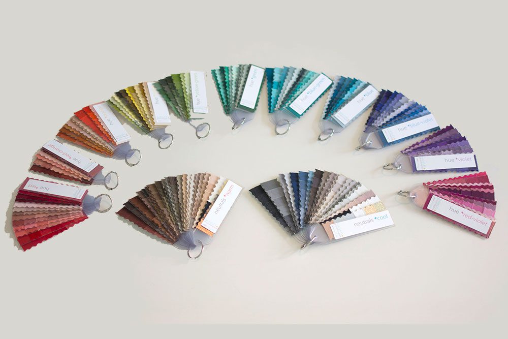
Each paddle in the system lists the Color Type(s) associated (Animated, Clear/Sharp, Subdued, Deep, Dynamic.) Having these as a reference helps you to select the right palettes for your clients based on their personality AND coloring.
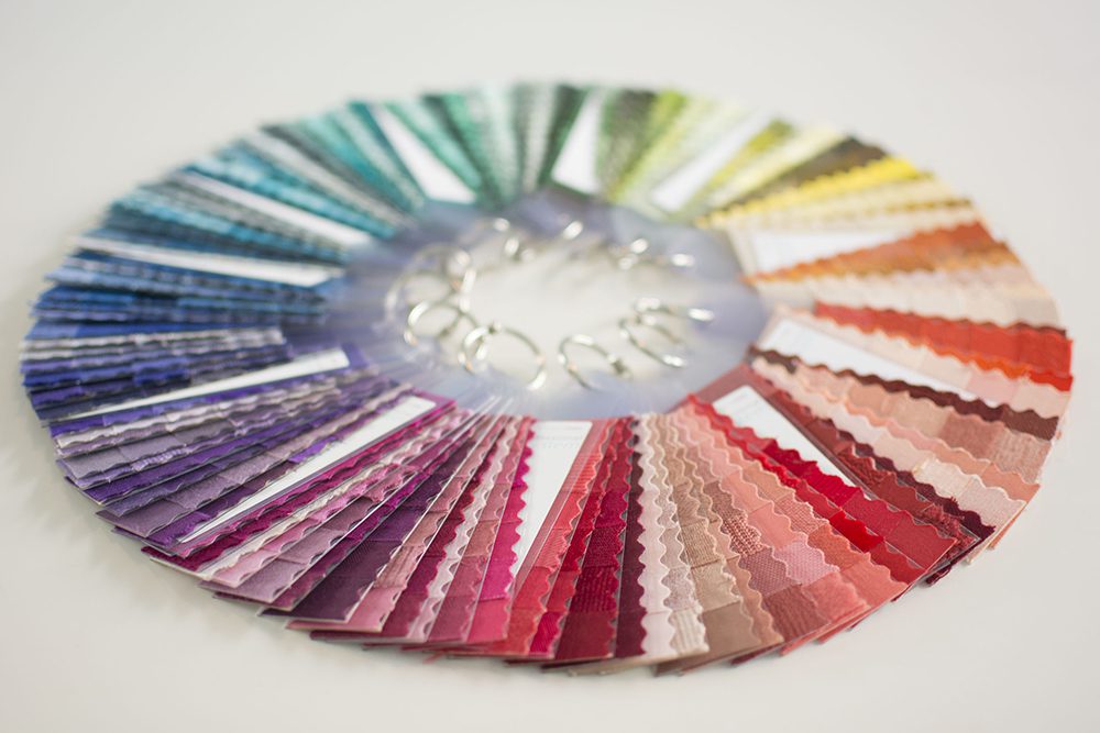
professional color system for color analysis

Over 900 Colors

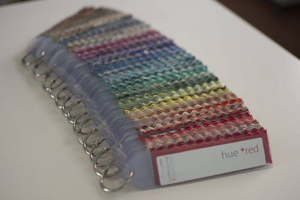
The system includes 155 paddles which make up 2 Neutral Portfolios and 11 Hue Portfolios (red, red-orange, orange, yellow, yellow-green, green, blue-green, blue, blue-violet, violet and red-violet.)

Based on human color

The human gamut of color (CIE L*a*b*) which is a three-dimensional space, is closely aligned to the Munsell system, considered the gold standard in the world. A special Munsell chart and wheel is included with the system.
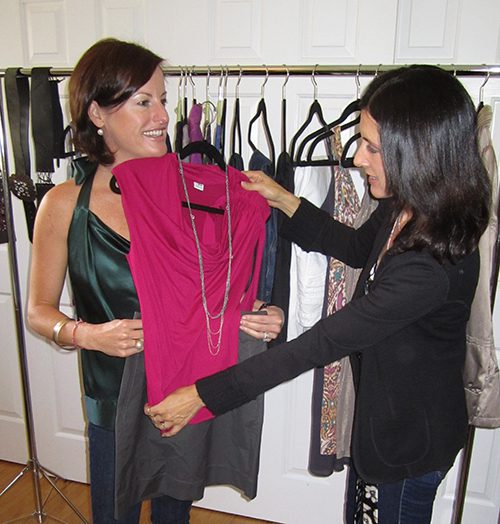
Easily Guide Your Clients to Express Their True Colors

System Investment

Pro Color System Only

$ 1,250
  • Over 900 colors delineated in 2 Neutral and 11 Hue Portfolios
  • Munsell chart and wheel card
  • PDF Instructions for use

Pro Color System with Training

$ 2,250
  • Everything in the Pro Color System, plus...
  • 4 online modules on How to Speak Color, Create a Color Blueprint, Conduct a Color Session and Develop Your Skill Practice
  • Munsell Workbook and Color Indicator Guides
  • Plus, Private Training Session with Arden
Popular

Frequently Asked Questions

It’s really easy to use because it is based on color theory so if you understand what hue, temperature, value and saturation mean – you are good.  This system gives you the freedom to pull what works for your client, and if they’re an artist or a designer, they will GET what you’re telling them about color because the system’s based on time-honored principles.

It typically takes about 45 minutes to an hour to conduct the analysis using the system. That’s because the client has lots of questions and a-ha’s. There’s two big portfolios of warm and cool neutrals and then a portfolio of each hue in the system.

There are no drapes. There are warm and cool indicators and saturation indicator cards in the Color Shop. They help you drill down on a client’s color temperature and color saturation(s) so that you pull the right paddles to hold under her face to see if they work.

Otherwise, you’d be going through all 255 paddles with a client which is not efficient. Each paddle in the master set has an order code and its hue, value numbers, and personality noted on the back to help you.

I prefer you go by what you SEE and know about your client versus the numbers on the back but they are there as a crutch until you feel comfortable.

The neutral paddles in the system are different. There are about 22 paddles in each neutral (warm & cool) portfolio in the system covering a range of browns, grays, blues, olives, beiges, metallics, etc.

The neutral palettes offered separately are not identical. The palettes include 3 paddles of light, medium and dark values for each dominant temperature and each paddle has 6  different colors.

If you click on the individual neutral palettes drop-down box (eg ‘silver cool’), the picture will pop up and you can see how they are different. The neutral palettes will help you understand what works well for each dominant temperature. Plus, they are perfect to use in workshops and for parties when you don’t have time to give individual attention.

On the other hand, the system has the full range of neutrals to pull from for your clients on an individual basis – you can be more specific with your custom palettes.

The link between personality and color is strong. It’s been written about by renowned color theorist & Bauhaus professor, Johannes Itten, and other artists and color colleagues.

Each of the paddles in the system is marked with it’s appropriate hue, value and chroma/personality.

The color indicator set includes cards for each of the personalities: tinted/clear, saturated/animated, shaded/deep, toasted/dynamic, and muted/subdued.

Many clients will see 1-2 of these personalities in their coloring and the fascinating part is that it mirrors their personality. I’ve seen it work on hundreds of individuals in the course of my work. It’s the one thing that your clients will remember you for and feel 100% supported and empowered in their color choices.

You can learn more about how to get to the heart of your client’s true colors by taking the Beginning Color Analysis course.

One of the 7 contrasts that Itten talks about is warm/cool. You must always recognize that everyone has a bit of warm and cool in them. To create harmony, we must always balance temperature.

I do not believe in ‘neutral’ skin for people — our skin is translucent, our hemoglobin and undertones have color – so ‘neutral’ really means they are warm and cool equally and you need to use both equally. So maybe a navy and a warm olive or brown.

Only a consultant who has the Pro System can dip into both – it’s difficult to create custom palettes for the masses because everyone is different.  You can utilize the dominant temperature neutral palettes in addition to the Pro System for workshops and parties as it sends your clients in the right direction, helps them think about it easily, but it’s not 100%. Best is for someone to work with you and get it done the right way.

The system does not delineate for shine or sheen or transparency, just by color attributes. There are some fabric swatches that have a sheen but it is only about 10% of the whole system. There is a metallic paddle in each of the warm and cool sets and so a client can be guided by shine with those swatches as there are dull, matte, shiny and glossy metallic.

I minored in art history and have been painting and drawing since…forever. I received my formal color training (68 hours) with the International Association of Color Consultants. The seminars provide an interdisciplinary approach to color (science, psychology, environment) and I was mentored by the late renowned colorist, Frank Manke.  Although the training is focused on architectural color, it provides the only multi-disciplinary approach to color as a universal language.

I had been styling for 10 years and created the system in 2007 because I couldn’t find the right color tools that were easy to get to the heart of an individual’s color and personality. I built my first system based on Johannes Itten’s teachings.

Itten (Bauhaus professor) wrote the book, Art of Color, and that is where the first ‘personal coloring’ concept came to light. He was a painter but could see how his students painted the colors that were in themselves. It’s uncanny how personality and color chroma/saturation are similar…he wrote a tiny bit about it in his book.

Then, with further studies I realized that Munsell had it right in just one little way that made me tweak it to where it is now — his system is based on perceptual vision. The artist’s color wheel is based on mixing paints. BIG difference. Because we are dealing with people, we need to use Munsell’s notation and wheel. The properties of color are the same (hue, chroma, value.)

Once you have the system, you receive a special login to order your client palettes. Your cost is $6/paddle and the case & cover are $5.75.

The cover is non-branded – it just says ‘palette’ and provides room for your client to write her name & phone in case it’s lost.

A client’s palette is typically 12-16 paddles (70-96 colors) and they last a long time (if they keep them protected in the case) What happens is typically after 7 years, your client’s coloring will change so a little refresher is needed.

Ready to Own Your Own Color System?

Order Your System Today!

The system comes in an acid-free box, is entirely hand-made and comes with instructions for use. Please allow 7-10 business days for shipment of your professional system.
Get my color system

10% Savings on all readings thru Dec 31. Use code COLORJOY.  Book Appointment