Last updated on April 4, 2021
Have you wondered what colors to wear and figured there was an easier way than looking at color palettes? (Don’t get me wrong, I love looking at color as it’s my livelihood.) But, there’s an important key to understanding some of your best colors to wear.
But first, an important story to help you SEE what I mean. ;)
The Birth of Scrubs
So, there’s this story that in the 1950’s and 60’s, surgeons and doctors were complaining of headaches and eye strain after long moments in the operating room. Apparently they kept seeing blue-green spots after spending several hours at surgery.
At the time, doctors and surgeons wore bright whites to convey ‘cleanliness’ yet those bright whites and bright lights in the surgery room caused eye problems.
So someone pretty smart decided that in order to alleviate the eye fatigue, the visual complement to blood, blue-green, should be worn by all in the operating room.
And you know what happened? No more headaches and thus, the story of why scrubs are blue-green was born.
The After-Image is the Key
What these professionals were experiencing in the operating room is what we call “successive contrast” or the “after-image.”
When you stare at a particular color for a long period of time, the cones in your retinas fatigue.
For example, if you gaze at the color red for an extended period of time, then the red-sensitive photo-receptors in your eyes become fatigued.
When you shift your vision to a white surface, the red stimulus is replaced by white and the cones start to ‘rejuvenate.’ But while they are adjusting, those photo-receptors that are only sensitive to blue-green (red’s visual complement) will function. Thus, you’ll see a blue-green image for a bit after. Want to try it?
Discover the Visual Complement to Red
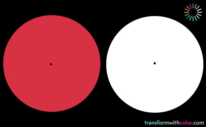
With the image above, stare at the black dot in the middle of the red circle for 30 seconds.
Then, shift your eyes to the black dot in the middle of the white circle. You’ll start to see the after-image, a light blue-green, appear and then fade soon after.
Why this is important for what colors to wear
Red and blue-green are “perceptual opposites, not paint mixing opposites” as noted by Albert Munsell, creator of the Munsell Color System.
What we visually see as the complement to red is blue-green, not green. Green is seen as the complement on artist color wheels and works great for mixing paint, not people. :)
Although I’ve talked about Itten’s Color Wheel in the past, it is not complete when thinking about the context of personal color analysis. (Although he was spot-on in identifying human personality characteristics with a person’s coloring and tastes.)
Complements, when paired together, stimulate and enhance each other. When they are mixed together, they unite into the perfect neutral gray. When you wear the visual complement to your hair, skin or eyes, you are enhancing your coloring in a dynamic way.
Here’s a brief overview of the complements in Munsell’s color wheel with Munsell’s unique color names in parentheses:
- Red and Blue-Green
- Yellow and Blue-Violet (Purple-Blue)
- Green and Red-Violet (Red-Purple)
- Blue and Orange (Yellow-Red)
- Violet (Purple) and Yellow-Green (Green-Yellow)