Did you know that your preferences for certain colors and textures are often influenced by your own natural coloring?
Over the past 20 years, working with more than a thousand individuals as a personal stylist and colorist, I’ve seen this again and again. People are naturally drawn to colors that reflect something within them—whether they realize it or not.
This idea is often linked to early color theorists like Johannes Itten, who taught at the Bauhaus in the early 20th century. However, as more information has come to light, it’s important to place his work in context.
A Note on Context
Itten made meaningful contributions to color theory, including the development of the 7 contrasts of color and early observations about subjective color preference.
At the same time, his work was shaped by the philosophical systems he followed, including his involvement with Mazdaznan, and some of his writings reflect hierarchical views about human difference that don’t align with how we understand people today.
Because of this, I don’t see his work as something to adopt wholesale, but rather as an early framework—one that needs to be examined, refined, and, in some cases, left behind.
What Actually Holds True
Here’s what I’ve found through direct experience:
People tend to feel most at ease—and look most naturally harmonious—in colors that relate to their own coloring.
Not in a rigid or prescriptive way. Not in a boxed-in system.
But in a way that creates visual coherence.
When someone wears colors that align with their natural coloring:
their features come into balance
their presence feels more integrated
and there’s often a subtle calming effect in the body
This isn’t about rules. It’s about resonance.
You see it instantly – someone walks into a room and everything just works. Nothing feels forced. That’s alignment.
"In my studies of subjective color, I have found that not only the choice and juxtaposition of hues but also the size and orientation of areas may be highly characteristic. Some individuals orient all areas vertically, others stress the horizontal or diagonal. Orientation is a clue to mode of thought and feeling. Some individuals include towards crisp and sharply bounded color areas, others to interpenetrating or blurred and haphazard patches. Individuals of the latter kind are not given to clear and simple thinking. They may be quite emotional and sentimentally disposed."
Subjective Preference vs. Clear Seeing
One of the more useful distinctions in early color theory is the difference between subjective preference and objective perception.
We all have colors we’re drawn to. But those preferences can sometimes override what is actually working.
In other words: Just because you love a color doesn’t mean it loves you back.
Learning to see color more clearly—beyond personal bias—is part of developing a deeper relationship with it.
A Quick Word on “Seasonal Color Analysis”
There’s a common misconception that early color theorists like Itten were the origin of seasonal color analysis.
They weren’t.
His work explored color relationships and perception—not categorizing people into fixed seasonal identities.
That distinction matters.
Because once we start boxing people into rigid systems, we lose the nuance and individuality that color naturally reveals.
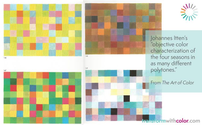
The REAL reason for the Four Seasons Paintings and why it has nothing to do with Seasonal Color Analysis
“The example of the four seasons shows that color sensation and experience have objective correlatives, even though each individual sees, feels, and evaluates color in a very personal way. I have often maintained that the judgment “pleasing-displeasing” can be no valid criterion of true and correct coloration…. Stated in terms of the four seasons, this means that for each season we are to find those colors, those points on and in the color sphere, that distinctly belong to that expression of that season in their relation to the whole universe of colors.”
Where This Leaves Us
Color is both personal and universal.
There are principles that hold true—balance, contrast, harmony. And there is your unique expression within those principles.
The goal isn’t to follow someone else’s system blindly. It’s to develop your own eye, your own sensitivity, and your own understanding of what creates alignment for you.
That’s where the real power of color lives.
If You’re Exploring Color More Deeply
Studying foundational color theory can absolutely expand your understanding. Just know that not every framework needs to be adopted as-is.
Take what resonates. Test it through your own experience. And let your understanding evolve.