Last updated on March 28, 2021
Each season Pantone® comes up with a fashion color report for the season’s most influential colors. These are of course, Spring color trends and so you may not see them everywhere you shop nor will all colors work for you. But there are some ways that you can make full use of these colors:
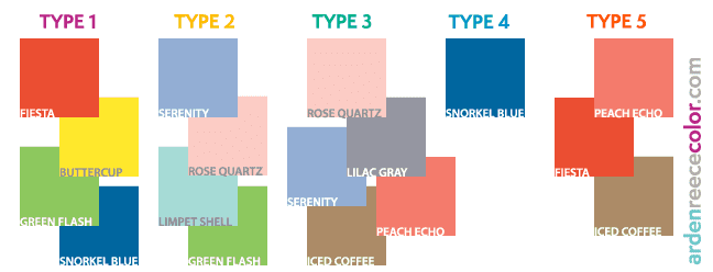
1. Wear the colors according to your type. This is just for clothing as it will harmonize and bring out the best in you. I’ve organized the colors under their dominant (or supporting) color type below for your easy reference.
Some of the colors are a mix of types such as Peach Echo (which is not 100% Type 5 but a mix of 3 & 5) and some colors are more dominantly featured under a type. If you’re Type 1, 2 or 3, you have lots to choose from. If you are Type 4, well…depending on your Supporting Type, you could easily hit the other types for accents. If you don’t know your color type, you can take the quiz here.
2. Wear a mix of the colors in a print with the dominant color being associated with your color type. This solves a lot of problems and luckily there are a multitude of beautiful prints available in stores right now. For example the dress shown in the picture below (Eliza J Scarf Print Maxi Dress) has Fiesta and Limpet Shell which is perfect for Type 1, 2 and 5.
3. Brighten up your home (and wardrobe) with new prints and patterns. The great thing about the Pantone colors is that you’ll see them in lots of housewares & textiles. The beautiful Snorkel Blue and Limpet Shell are seen everywhere and I especially love them as patterns to a new soup bowl or pillow…let alone a great new beach tunic.
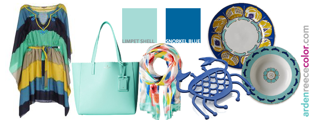
Check out some of the Snorkel Blue and Limpet Shell items on my Pinterest page for more ideas.
4. Pair two colors together to create an updated Spring look. In the picture way above, I show colors that the main color can match with. Pick one color that you’d love to try and pair it with another to create a new look. The wonderful thing about the colors is that you can vary them so that they are more aligned with your color type.
In the example below, I show Iced Coffee paired with Buttercup. If bright Buttercup is not part of your palette, lighten it or toast it so that it is more you….there are no cut and dry rules. And if you’re looking to add yellow to your wardrobe this season, now is the time as there is lots to choose from!
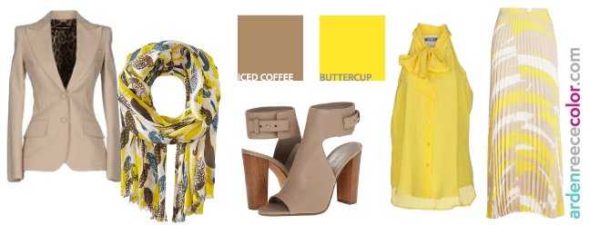
Check out some of the Buttercup and Iced Coffee items featured on my Pinterest page for more ideas.
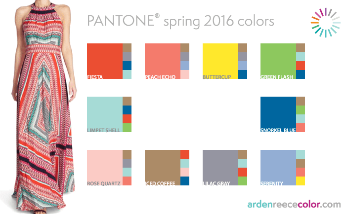
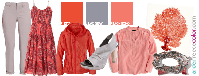
Another fun combo is Fiesta and Lilac Gray, Peach Echo and Fiesta, or all three together!
Since Lilac Gray is a bit tough to find the exact color, any gray will do — gray is always the toughest color to find since it sells out so quickly — it’s a great neutral and perfect for adding as pants or a shoe. All the Pantone Spring 2016 colors work with gray so you can’t go wrong.
Spring colors don't change much each year
Although Pantone’s business is all about selling color, Spring colors don’t change that much each year. Yellows, tans, navys, aquas and corals ALWAYS pop up so you can still refer to this article for color matching and harmonies.
Which Pantone color is your favorite and what colors will you be playing with this Spring?